VizHIS - Streamlining Healthcare Workflows
Role: UI/UX Designer
Duration: 1.5 years
Tools: Figma, Jira
Team: Product manager, developers, QA, and clinical stakeholders
Overview
VizHIS is a Health Information System that helps hospitals and clinics manage patient data, telehealth, and administrative workflows from one centralized platform. Our goal was simple: make it easier for healthcare professionals to focus on patients, not paperwork.
| My Roles | Duration | Tools/Tech |
|---|---|---|
| UI/UX Designer | 1.5 years | Figma |
Challenges
- Understanding a complex healthcare domain with high data density and regulatory constraints.
- Designing for workflows that required detailed medical input while keeping screens intuitive and uncluttered.
- Ensuring ADA and WCAG compliance across all modules, from data tables to telehealth interfaces.
-
Maintaining design consistency across multiple feature teams.
Design Approach
- Early Collaboration - Joined weekly design sessions with the BA, other UX designers, and Product Owner early in the project to clarify requirements, align on user flows, and resolve feature ambiguities before design began.
- Domain Immersion - Partnered with clinical SMEs to understand terminology, data dependencies, and real-world use cases.
- Information Hierarchy - Reorganized complex layouts to surface essential information first while reducing cognitive load.
- Accessibility Focus - Applied WCAG 2.1 standards for color contrast, keyboard navigation, and ARIA labeling.
- Design System Integration - Created reusable, responsive components to maintain visual consistency and streamline development handoff.
Feature Highlights
Throughout the redesign, I focused on improving clarity and reducing the effort required to navigate dense clinical data. Each module was refined or built from scratch to support real workflows - helping clinicians act quickly, access the right information, and maintain focus during patient care.
Below are a few examples that illustrate how these goals translated into the product experience
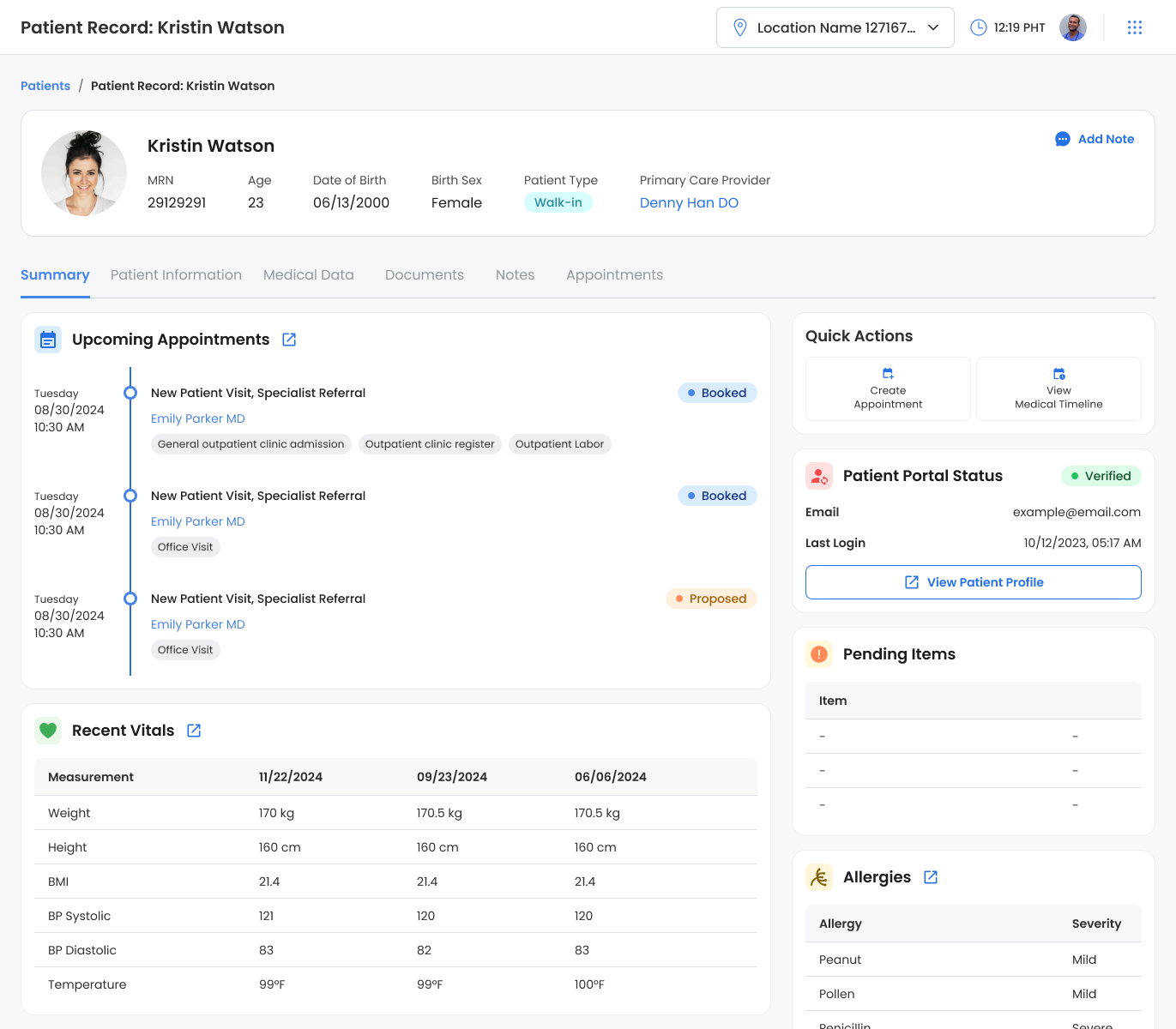
Patient Summary
Redesigned the patient summary screen to surface the most relevant information upfront. Previously, this data was scattered across different sections. By reorganizing it into a single summary view, clinicians can now understand a patient’s current status and next steps at a glance, without navigating multiple menus.

Medical Data - Medical Problems Screen
Organized patient medical problems into a clean, structured layout that surfaces key details first. Clinicians can quickly review active issues, add new entries, or update resolved conditions without scrolling through long, ungrouped lists.

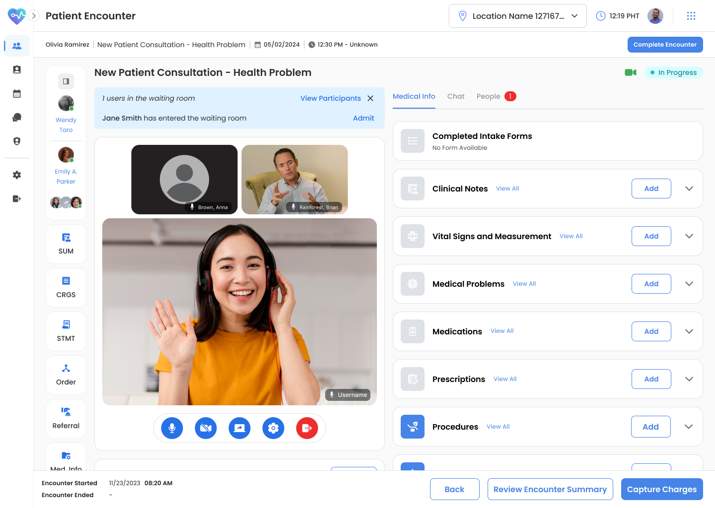
TeleHealth Screen
Built a two-panel telehealth interface that allows practitioners to conduct video calls while viewing or updating patient data in real time. The layout supports multitasking - adding medical notes or reviewing charts without leaving the call window.

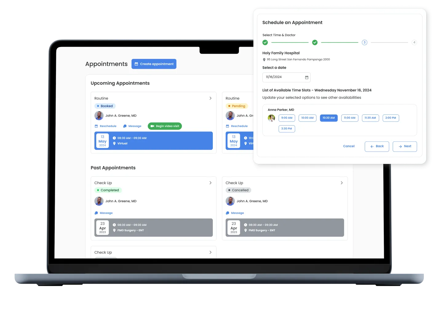
Patient Portal
Created an easy-to-navigate portal where patients can view their upcoming appointments, access visit summaries, and manage bookings. The redesigned appointment screen presents future visits clearly and guides users through the scheduling process with fewer steps.

Key Outcome
- Improved readability and task flow for clinicians managing patient charts and telehealth sessions.
- Established accessibility patterns adopted across other VizHIS modules.
- Created a unified component library that reduced UI inconsistencies and design debt.
Reflection
VizHIS challenged me to design for precision, accessibility, and empathy all at once. Early collaboration with the BA and PO teams helped ground every feature in both user and business needs. It was a reminder that clarity in communication is just as important as clarity in interface design.
