
Runestone Interactive E-book
INTRODUCTION
The project is to review the open-source e-book platform Runestone Interactive and make suggestions for improving the usability. For this project, we are focusing on the Win21-SI206 (an undergraduate level Python course at the University of Michigan) class materials, including Parsons problems, the assignment creation interface, and collaboration tools. We plan to produce suggestions for interface changes by interviewing users, conducting surveys, observing user engagements, and examining log file data to propose improvements through user studies. The e-book is one of the course materials that the client, Runestone Interactive Creator, uses for the Win21-SI206 class. In this class, students can learn Python by using the e-book’s interactive tools such as Parsons problems (drag-and-drop code blocks) and assignment features during the class and after the class. We will be focusing on four areas: the mix-up code problem, write-up code problem, Assignments page, and features that can help students collaborate in the class setting.
TARGET AUDIENCES
- Win21-SI206’s students
GOALS
- Provide suggestions for the Runestone ebook interface improvement
| My Roles | Duration | Tool |
|---|---|---|
| UX consultant | 3 months | Figma, Qualtrics, Miro |
METHODS
- User interview
- Usability Test
I. INTERVIEW
We interviewed 4 students currently taking Data-Oriented Programming (SI 206).
Although their demographics were very similar, students had different reasons for
taking SI 206. For some students, the course was being taken to cover a future
requirement after they switched majors. For others, it was an elective taken to help land
a consulting job after graduation. Regardless of the reason, all students had some
programming experience prior to SI 206.
- Male - 19 years old, undergraduate, Business Administration major
- Female - 19 years old, undergraduate, Cognitive Science major
- Male - 19 years old, undergraduate, Computer Science major
- Female - 19 years old, undergraduate, Computer Science major
To analyze the interview data, we decided to use Affinity diagrams utilizing Miro. Miro is the online platform where you collaborate virtually through sticky notes. In each debriefing session, we gathered around 25-35 notes and put every affinity note on
individual sticky notes. After all the interviews were done, we started our interpretation
session. This is where we started our affinity diagram wall, in which we went over all
the sticky notes as a group and tried to cluster them into different categories.
As a team, we grouped similar ideas in the same group and each group we came up
with summary sentences. We iterated this process a couple of times and concluded five
high-level thoughts. In this exercise, we discovered four key findings on the high-level
category and the fifth one being student demographics. Based on the findings, we
started our brainstorming session where we listed out the frustrations we discovered
and came up with a list of recommendations to solve these problems.
| Finding | Recommendation |
|---|---|
| 1. One of our findings is that mixed-up code problems are valuable for students’ initial learning, but it can be difficult when working in a group because each student has a different order. Participant 3 stated, “I like [Mixed-up code problems]… I feel like just doing them a bunch of times helps me understand the structure of like, a class, for example.” Others have also reported information that backs up this statement. Participant 1 conveyed that mixed-up code problems help with learning and understanding indentation. A challenge with mixed-up code problems arises when working in groups. One interviewee informed us that the questions are the same, however, the code blocks on the left side are usually in a different order. | - Explanations for why code is wrong. This will help students develop a deeper understanding of Python. - For group assignments, code blocks should be consistent. This will make the group work experience better because everyone’s code will match up. |
| 2. For write-up code questions, students find them to be most helpful but desire feedback when they input the wrong code. Some students like to write the code themselves because they find it helpful for their learning. Participant 2 likes the load history feature of the write-up code question because it provides easy access to previous code that was written. There was one main thing that students want to be improved with write-code problems: receiving feedback. Students have said “Fill-in-the-blank problems do not tell you what the correct answer is” and “There is no feedback received for writing your own code.” | - Add a “Help Me” button to write-code problems that can check the code line by line and inform the student what is right and what is wrong and why. - An alternative is showing other possible codes that can work as well. This will let students know that there can be multiple ways to code something. |
3. Some of our interviewees believe that the “Help me” button is really helpful when they are stuck with the code by guiding them one step at a time. An interviewee uses the button as a way to get help without asking the professor. However, one student feels like if they click the “Help me” button enough times, it will just eventually lead them to the answer without them actually putting a special effort. The figure below shows that after users click the “Help me” button for the first time, it combines two code blocks into one. 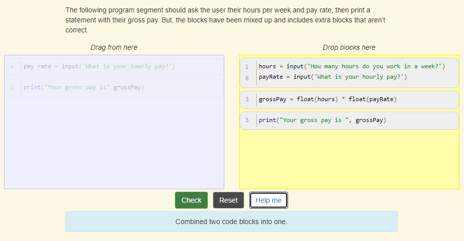 |
- Limit the number of times students can use the “Help me” button per question - Make it harder to get hints |
II. USABILITY TEST
As a follow-up to our team’s previous research findings on the Runestone Interactive E-book, this report will focus on usability tests that we conducted with current students in SI 206. A usability test is asking the user to complete various tasks to see if the user can complete the tasks or not and observe how the user completes tasks. Given our findings throughout the semester, we developed research questions for the usability tests:
- How easy is it for users to solve the mixed-up code question?
- How easy is it for users to solve the write code question?
- Where and how do students find answers when trying to solve the assignment problem?
- How easy/difficult is it for a user to navigate between the assignment tab and the rest of the book?
- Is it convenient for students if they want to check their assignment scores?
We believe it is important to ask these questions so that we can understand the users by observing and analyzing how they interact with the e-book. The usability tests gave us valuable data to determine what challenges users encounter and generate ways to solve their problems.
As a group, we prepared 5 different tasks along with pertaining subtasks for each user to execute. These 5 tasks were selected because they were areas identified to benefit from design changes from both the survey findings and heuristics evaluation. To confirm these tasks, a detailed copy was shared for final approval with the client. Next, the 5 tasks were vetted by the results of a pilot study which confirmed the usefulness of the usability test outcome and the appropriate tasks for our target audience. One pilot test was conducted over Zoom and the participant had previously studied python as part of their undergraduate studies at a non-UM university. This participant was selected to participate in the pilot study because they were familiar with python but had not practiced it in recent years, were new to the e-book, and their availability matched that of the team. One concern we had prior to the pilot test was the length of the usability tasks, but after the pilot test, the current tasks were confirmed to be an appropriate length (about 30 mins not including debrief and post-questionnaire).
Participants: 5 students in SI 206
An interest survey was sent to the students in this class via email by the professor. All selected participants were provided with a $20 gift card. Five students from SI 206 participated in the usability test and had very similar demographics (i.e., same course, gender, and were undergraduate students). The exception to this was the students’ comfort levels with programming in python, coding experience prior to SI 206, as well as the students expected class grade (A and C). Due to not having a variety of grade ranges, only one student with an expected class grade of C was included. The client was interested in learning from both students that were comfortable with python and those not so comfortable (neutral). Given these expectations in characteristics, as well as their availability, the following participants were selected to participate in the study.
Order of description: gender, college level, coding experience prior to SI 206, expected grade, comfort level with python at the time of the usability test.
- P1: Female – undergraduate, novice, A, comfortable
- P2: Female – undergraduate, novice, C, comfortable
- P3: Female – undergraduate, novice, A, neutral
- P4: Female – undergraduate, intermediate, A, neutral
- P5: Female – undergraduate, novice, A, neutral
Test setting, equipment, and recording methods:
Prior to each test, the team decided that each member would serve as a moderator for one test while the other 3 served as note-takers, timekeepers, and participated in the debrief of all tests. One team member moderated two tests. All tests took place over Zoom and required the participants to share their screen and maintain their camera on to observe facial expressions. All participants were informed about their right to withdraw from the test at any time, were aware that their grade would not be affected by participating in this study, and that their participation would be kept anonymous. The participants all provided their permission to take part in the study and be recorded for the purposes of the study.
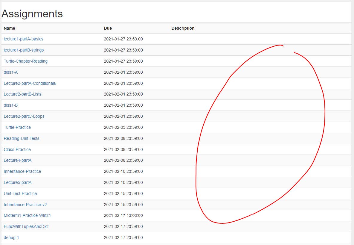
Finding 1: The Assignment page’s problem score/status is hard to track
2 out of 5 participants mentioned that they would prefer if the score is visible on the Assignment page. One participant specifically pointed out that seeing no score available out in the Assignment made her feel unsure and scared that she might miss an assignment. Below is the current state of the assigment page:
Recommendation:
We suggest having an indicator on the “Description” column on the right to let users know whether they have finished the assignment or not. It can be either a progress bar, a green checkmark, or even more convenient, the number of questions they already completed per assignment.
Finding 2: The Table of Contents lacks visual hierarchy, thus makes it difficult to search for a subchapter or a specific keyword
When we asked participants to find a chapter that is relevant to the problem that they just did, 4 out 5 participants used the “Question in Context” link to get to the chapter. However, one participant was not aware of this link and struggled to manually find the topic mathplotlib from the Table of Contents. The Table of Contents is long and it takes a while to skim through it. This incident also strengthens one of our findings in the heuristics evaluation regarding minimalism.
Recommendation:
We recommend adding visual hierarchy and more structures to make the Table of Contents easier to navigate (i.e make the chapter title bigger/bolder, allow chapters to collapse and expand in order to save space, give users more control and minimize unnecessary scrolling).
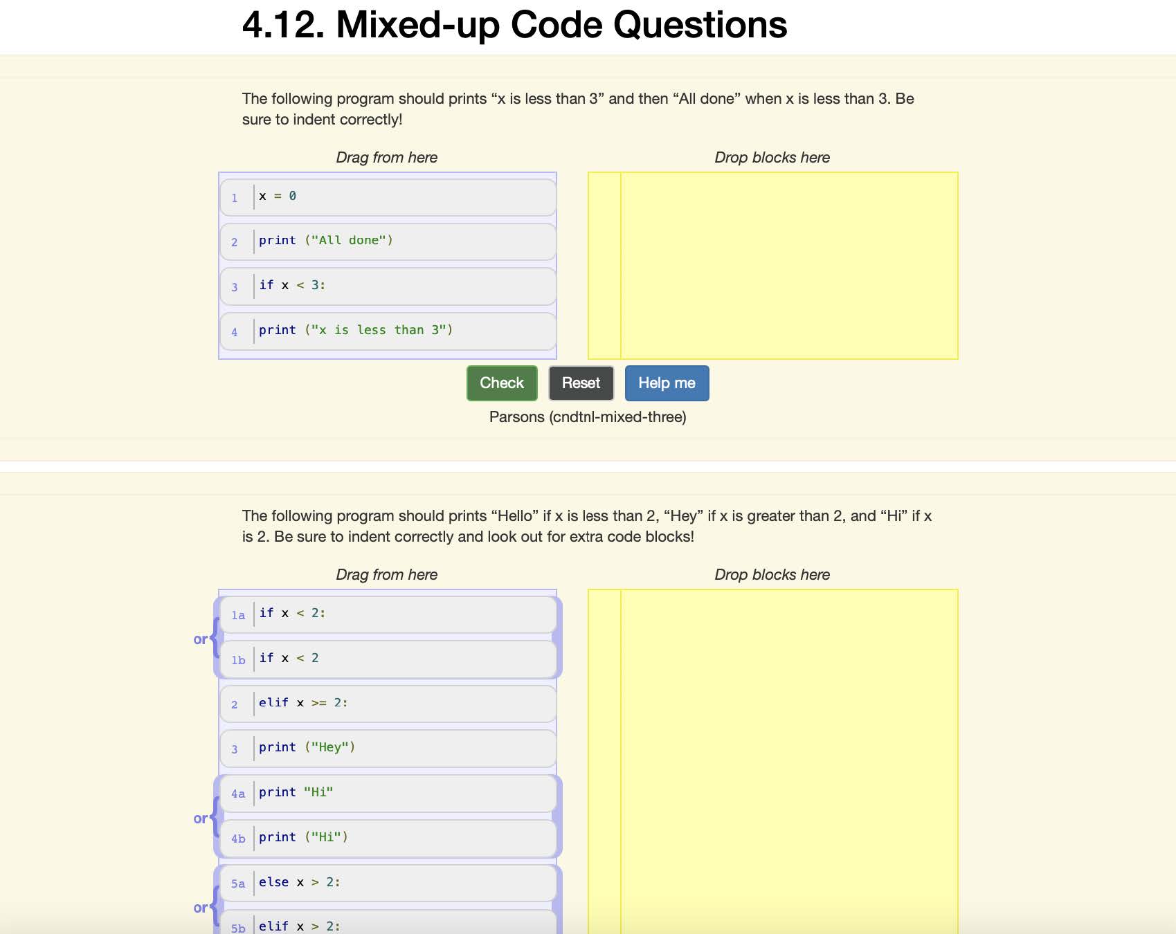
Finding 3: The problem set is hard for students to follow along due to no number indicator
We noticed that when asking participants to perform the Mixed-Up code question tasks, all of
the students had to verbally count the problems in order to locate the right problem that we
asked them to solve because the problems are not numbered (Fig. 2). They also needed to
check with us to see whether they have the right problem to work on. Based on our judgment,
this would cause an inconvenience or miscommunication when students are trying to
communicate the problem that they are working on with each other or the instructor during the
discussion. After further investigation, this UX problem not only appears in Mixed-up code
questions but also in many other sections like assignments and some of the chapters.
Recommendation:
We suggest that all the questions in the problem should be numbered in the same way and
have the same number location to avoid confusion for students. Below are two examples of lacking numbering and inconsistent numbering
Finding 4: The three distinctive attempts rule for using the “Help me” button seems confusing to students.
Although not every participant used the “help me” button function while doing the usability test, we noticed that, for participants who tried the “help me” button, they did not fully understand the three attempts rule to activate the “help me” button. One of the participants tried moving around the code blocks several times but still wasn’t able to use the “help me” button and showed her frustrations about it.
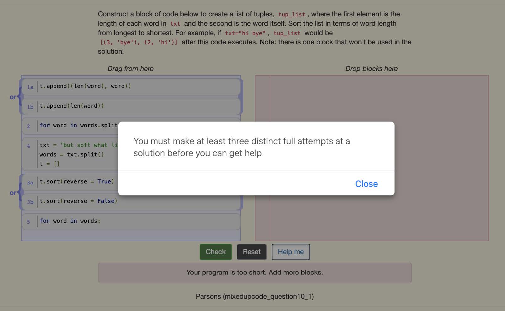
Recommendation:
We suggest that having a more clear explanation of the “three distinct full attempts” can help students to better understand how to use the “help me” button and reduce the frustration from not being able to solve the problem and get help.
DISCUSSION
There might be some shortcomings within our usability tests. We had five participants and all were women. This is not fully representative of all students currently enrolled in SI 206 because the participants in the usability tests were not diverse in terms of gender. Additionally, the small sample size does not allow us to capture everything.
Behavior using the check me button and the Help Me button might be different because they are being watched. Participants may not have used the Help Me button as often while being observed. This is important because it affects the data we can collect and analyze. Students have completed some of the problems, so that could affect the way they tackled some of the tasks. Depending on the problem, some users talked through their process of completing the problem, while others redid the problems entirely. This discrepancy is important to recognize because it results in how users did the tasks and data can be slightly different for each participant as a result of this.
The students’ confidence level when explaining things such as if they know why the Help Me button removed something seemed low. When they were explaining things, their tone made it sound like they were not certain. This raised conversation in our debrief session about students not fully understanding and convincing themselves that they know and understand how the code works because they see the correct answer.
If we had more time, we could implement new changes in the user interface. Then, test the changes by doing more usability testing on the new design. We could have participants complete the same tasks as the participants in this usability test to compare and contrast the data using the current e-book and the updated e-book.