When2meet Redesign
About When2Meet
When2meet (when2meet.com) is a web-based product that helps people visualize their schedule with others. By being able to select the time that works for themselves, every members of a group can see when to arrange a meeting with each other would fit everyone’s schedule the best. On When2meet format, members can choose to fill out their weekly schedule availability, or choose specific dates on the calendar and add their availability. When2meet is created by 8 DEGREES LLC, a company that specializes in application and software development. When2meet was released in 2012, and the interface still hasn’t changed much.
What makes it a good candidate for a redesign is that as it is, the product solely fulfills its role and that’s it. The interface is lackluster as it is merely a barebones design made to just get the job done. A lot of improvements could be made which would give it a strong boost over its competitors.
| Before | After |
|---|---|
 |
 |
| My Roles | Duration | Method | Tool |
|---|---|---|---|
| UI/UX Designer | 3 months | Competitive Analysis | Figma |
| Interviewer | Surveys + Interviews | ||
| Usability Test + Cognitive Walkthrough | |||
| Heuristic Evaluation |
I: COMPETITIVE ANALYSIS
To learn of which aspects When2meet we could improve, we picked four other product, two direct competitors (whenisgood + Doodle) and two indirect competitors (MeetingPlanner + Google Calendar). Doing this provides us some inspirations in our redesign of the app.
| whenisgood | Doodle | MeetingPlanner | Google Calendar | |
|---|---|---|---|---|
| Functionality | ||||
| Create Event | Y | Y | Y | Y |
| Create User Account | Y | Y | Y | Y |
| Generate Sharable Link | Y | Y | Y | Y |
| Create Reminders | Y | Y | ||
| Edit Event | Y | Y | Y | Y |
| Export Addable File/Integrate to Calendar | Y | Y | Y | |
| Add Suggested Meeting Place | Y | Y | Y | |
| Indicate/Auto-update Time Zone | Y | Y | Y | Y |
| Usability | ||||
| Back Button | Y | Y | Y | |
| Zoom In/Out | Y | |||
| Back to Homepage | Y | Y | Y | Y |
II: USER RESEARCH
Background: This stage we focus on researching the user base of When2meet, with the purpose of understanding their goals, values, lifestyles as well as the needs they have when it comes to scheduler products.
Methods: To conduct research to learn about When2meet current users, we utilize two distinct research methods -interviews and survey.
Our Study Objectives focused on being able to understand the context in which people are typically in when they seek to use the When2Meet service. This included learning typical age ranges of the person, their current occupation, how often they needed a service to assist them in scheduling meetings or other appointments, their gender, and other characteristics about the user and how/why they approached this particular system. Gathering this kind of information will assist our team in redesigning When2Meet specifically for the user base. We can do this by creating personas based on the information we obtain and work from there.
Interviews: Each member was tasked with doing at least 2 interviews each being around 20-30 minute long and we did a total of 11 interviews. We recruited participants that we thought would fall under the target population, therefore we recruited participants that were mainly college students (undergraduates and graduates) as well as people that frequently worked in group environments (software engineers, business majors, etc.)
Survey: As a team we decided upon creating a survey which included 20 basic questions that revolved around gathering information about our target population and the context in which they use When2Meet or even other scheduling services. After deciding on what questions we should ask, we each sent out at least 5 invitations for people to take our survey. The recipients of these invitations were those we had the emails in order to ensure that it at least reached 25 people.
Personas


III: USABILITY TESTING
Usability Tasks: We conducted six usability tasks with each session lasting around 20 - 25 minutes on average. We recorded the participants while they were performing our usability tasks. For this, we thought up of five tasks that our participants would carry out. These five participants were recruited by each individual team member, each team member carried out a complete usability test.
Cognitive Walkthrough: By doing this, we figured out different usability issues which may make it difficult for the user to use When2Meet.
Findings:
Issue 1: Changing the calendar/month from the default dates given by the system
Ex: Changing the below dates to display weeks in October of 2019 would be difficult to find out how due to the lack of scroll bar
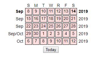
4/5 users that we tested all had trouble figuring out how to scroll to their desired date. 3 of our users tried using the scroll wheel while hovering over the calendar at first, while the other person tried to click and drag down.
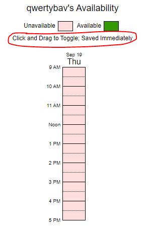
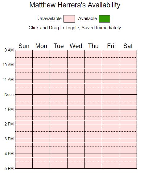
Issue 2: The instructions to select availability is not immediately noticeable
The instructions here are circled in blue. The font is small and too late for it to be displaying important information about how to interact with the system.
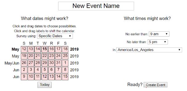
Issue 3: The “Event” name box is not clearly something that is required to be edited. 4 of our 5 users found it unclear that it was something to be touched.

Issue 4: Clearing/filling the availability boxes by clicking and dragging is difficult due to the large room for error that is given by such small boxes representing segments of time. Clicking in the wrong box means that it incorrectly displays the user’s desired availability.
Issue 5: The interface is overwhelming for new users.
Specifically, in creating a new event, users are given all the requirements to do so in one screen rather than being given a step by step process. All the information and necessary boxes needed to fill in can be too much for a new user to try and figure out what they need to do with all of the options.
Issue 6: The interface is overwhelming for new users.
Signing in with an incorrect username will simply create a new user. This is a mistake which is very easy to make, and When2Meet doesn’t provide any mechanism that can prevent this.
Issue 7: There is no way to go back to the sign in page if you have already signed into an account. There is no way to redo/undo this action through the interface. You must revisit the event link in order to do so.
Issue 8: Cannot change the title, dates, or time range of an already created event.
Only the availability and time zone can be changed. No other options of customization are given, even if they are the creator of the event.
PHASE IV: REDESIGN
After reviewing the data we got, these are the targets that we decided to redesign:
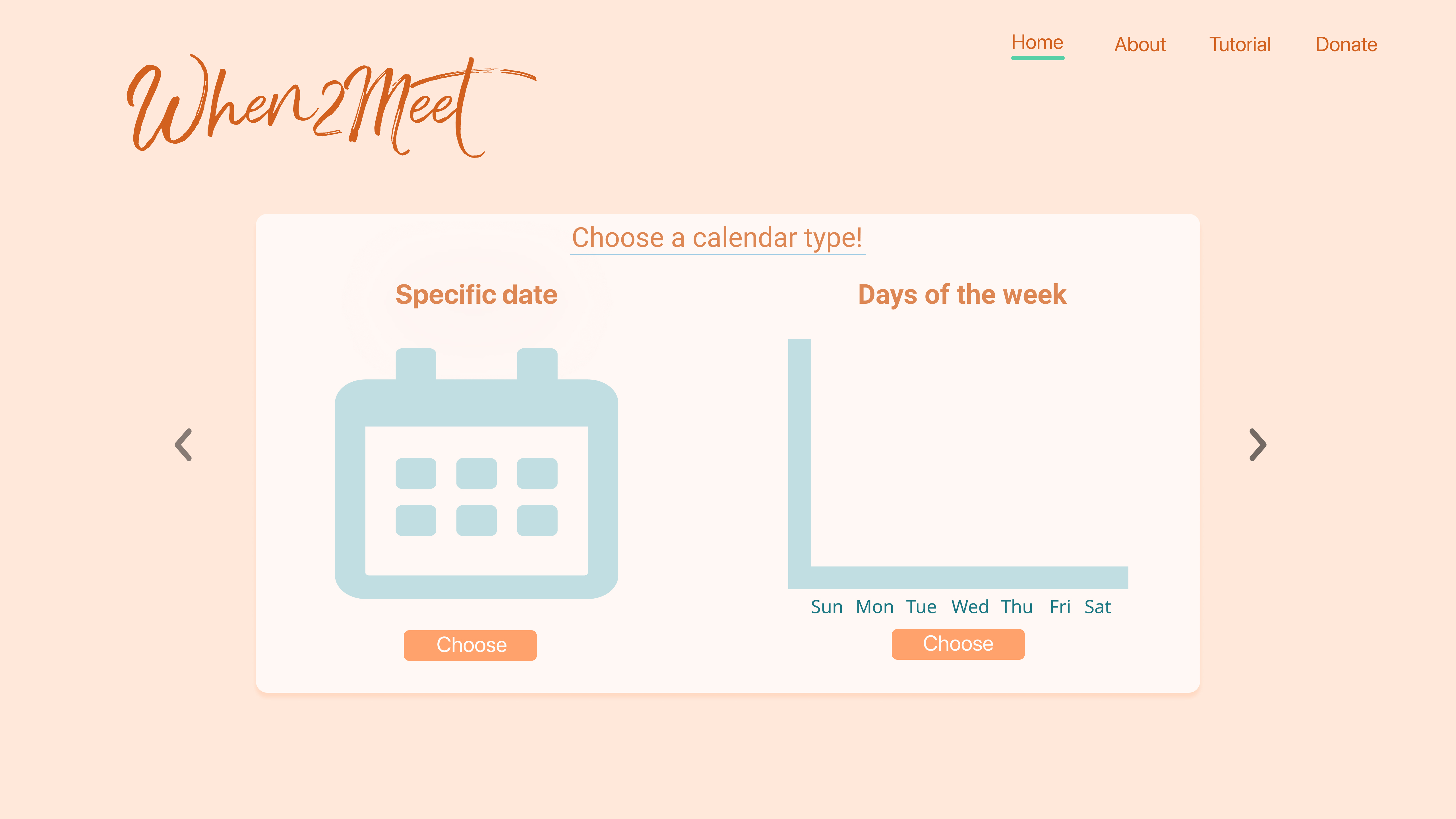
Homepage: Many participants in our usability test found that the homepage is overwhelming and confusing (especially for new users). Too much information on the same page makes it difficult for them to figure out where to start and what they need to do.
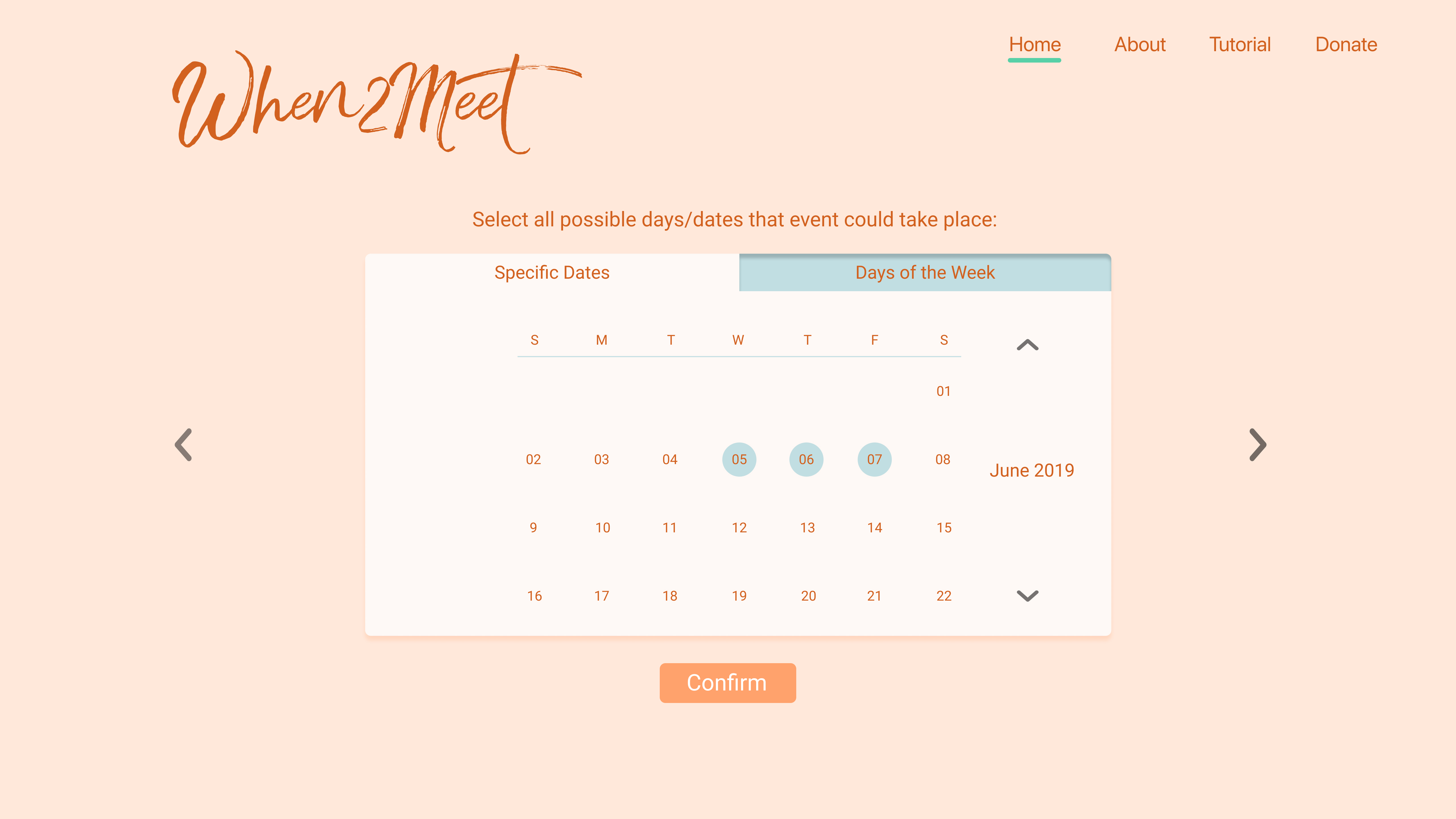
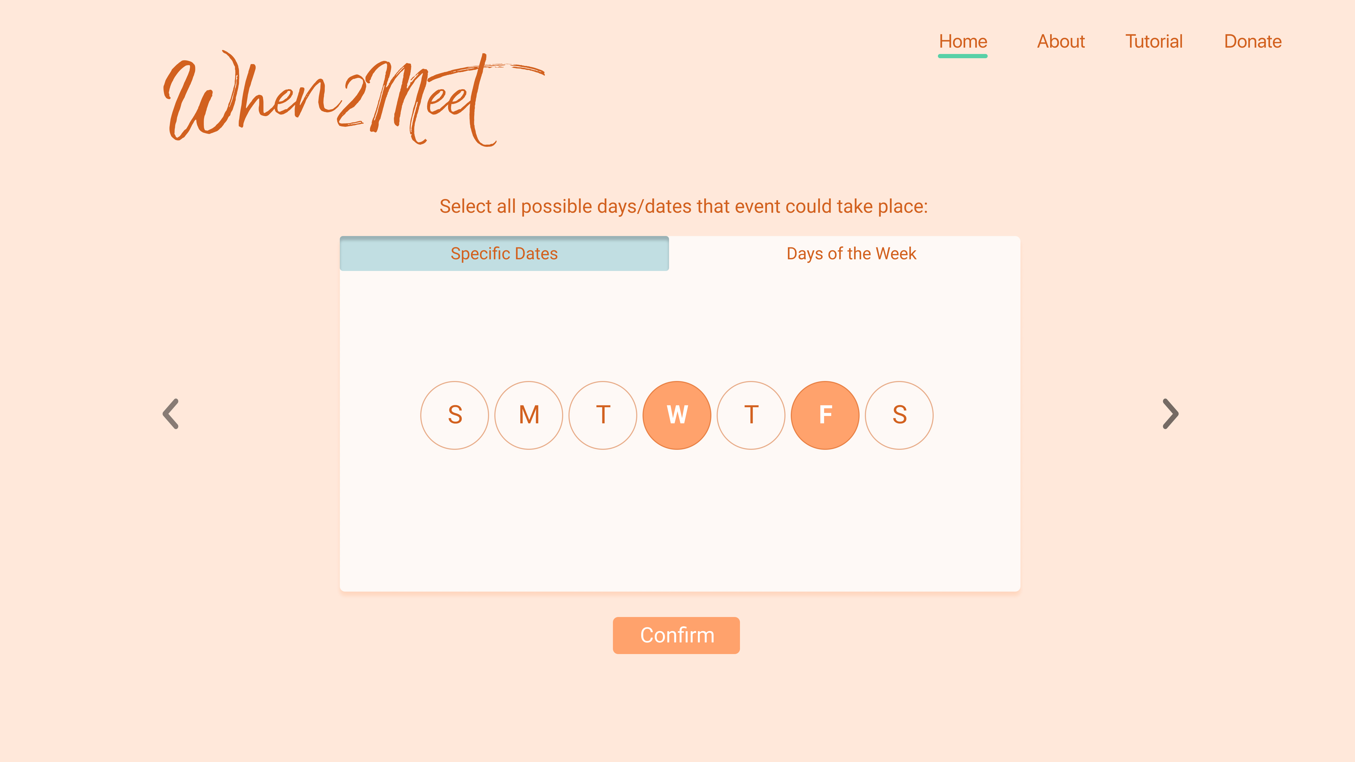
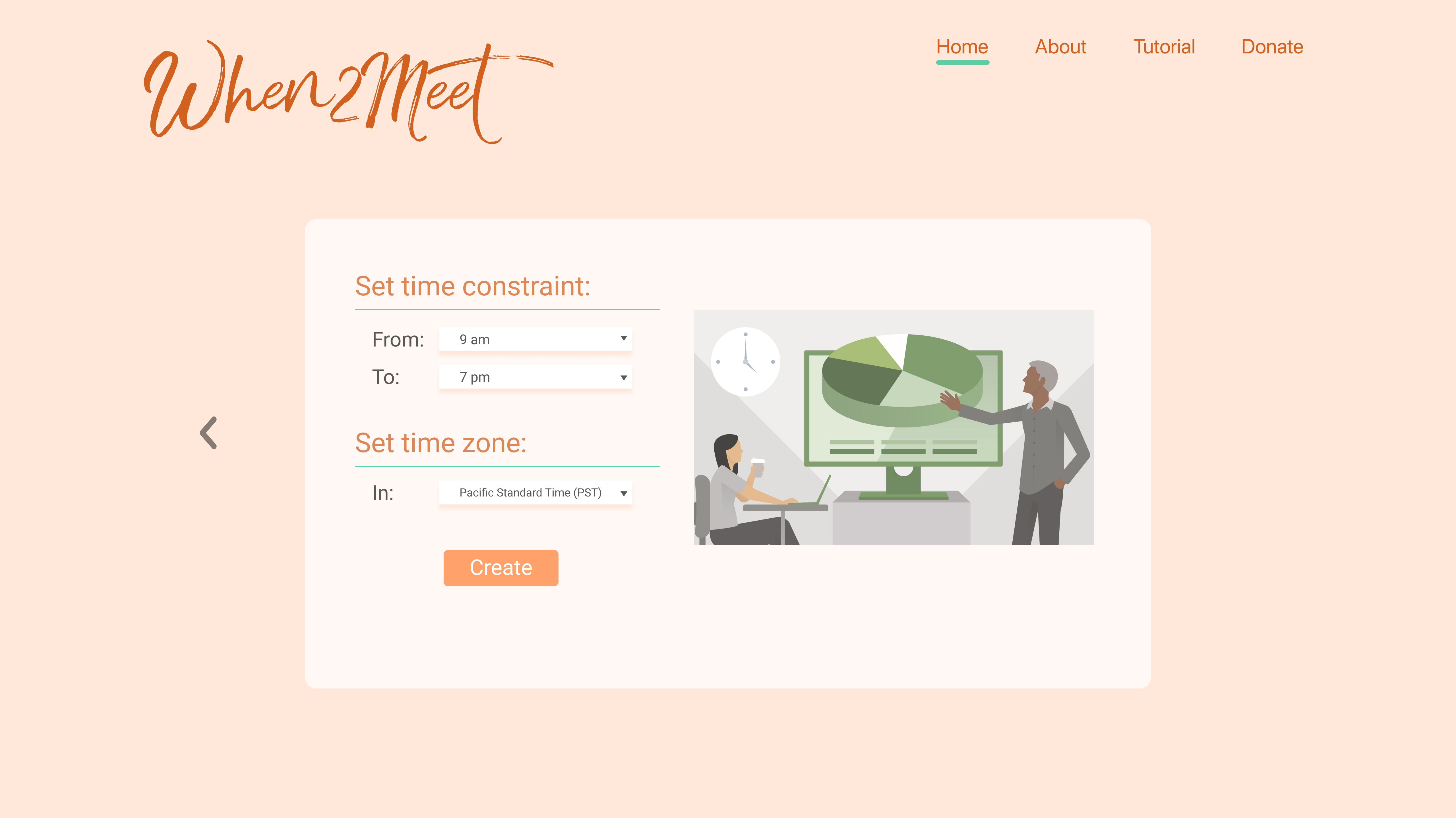
Event Creation Process: This one is related to the homepage. All the steps combined in the homepage make the users confused as we indicated above. Also, when choosing the dates, the lack of scroll bar makes it difficult to change the month/year (4/5 users in our usability test had trouble with this task).
Availability Indication: Through cognitive walkthrough and usability testing, we realize that the instructions regarding how to select availability are not noticeable enough. The font is small and blends in the background which makes it really hard to see. The option of entering both username and password is confusing too.
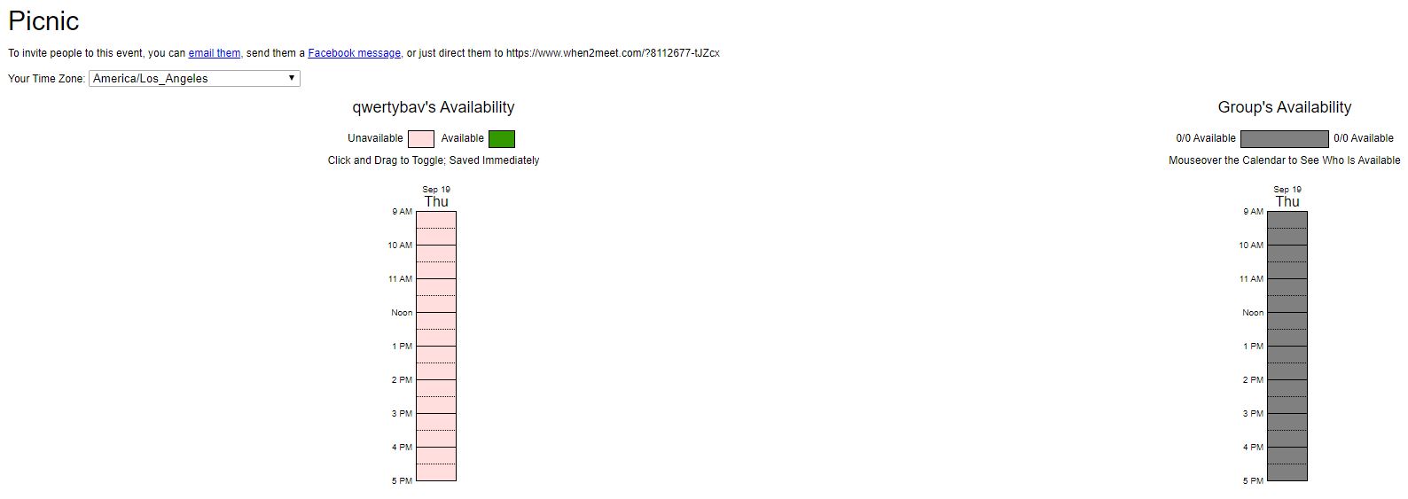
Sharing Process: During usability testing, we found that the email option is not visible enough, and it took users awhile find it. The share-through-Facebook option doesn’t work at all. For the sharing link, we will have to manually use the mouse and drag to copy it, which is not efficient.
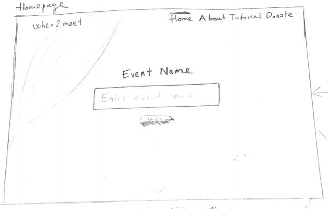
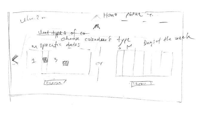
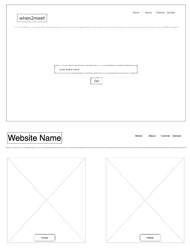
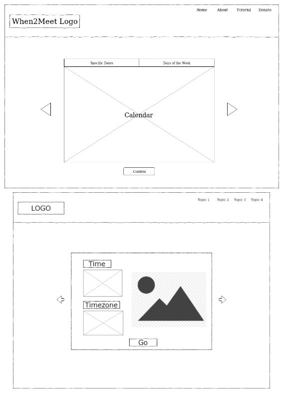
Sketches:
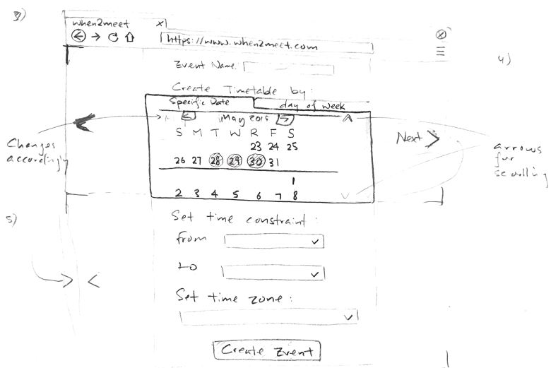
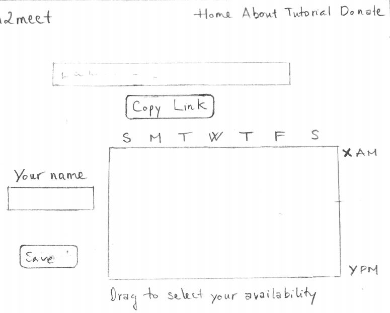
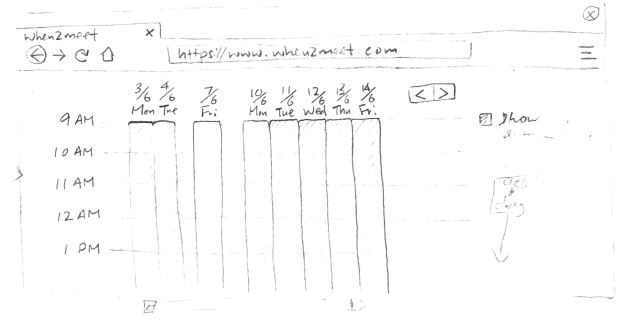
Wireframes:
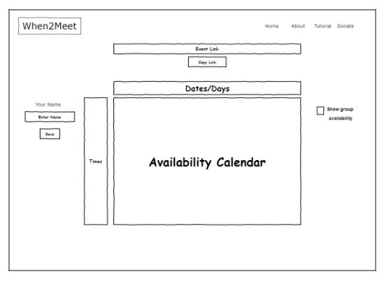
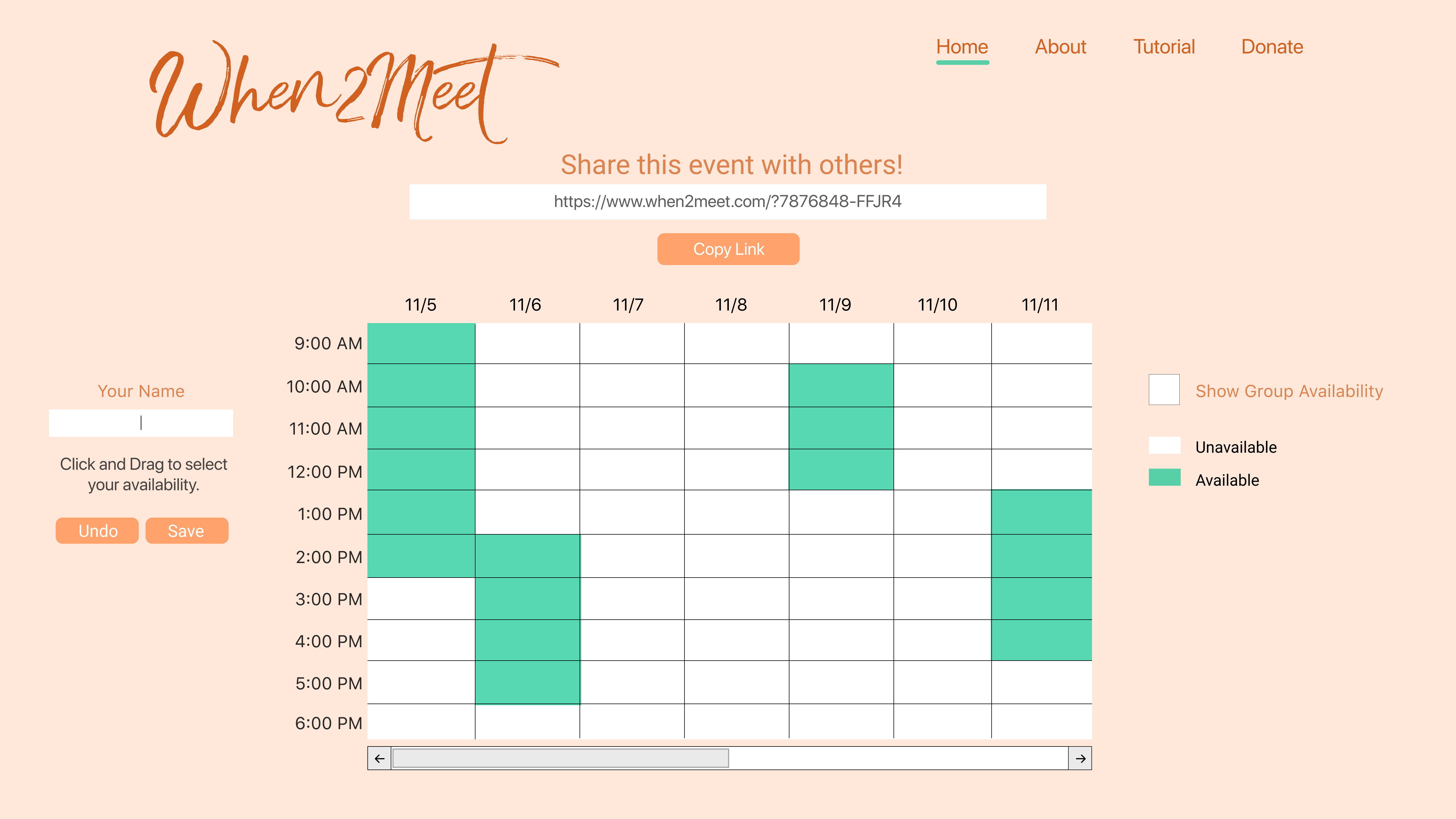
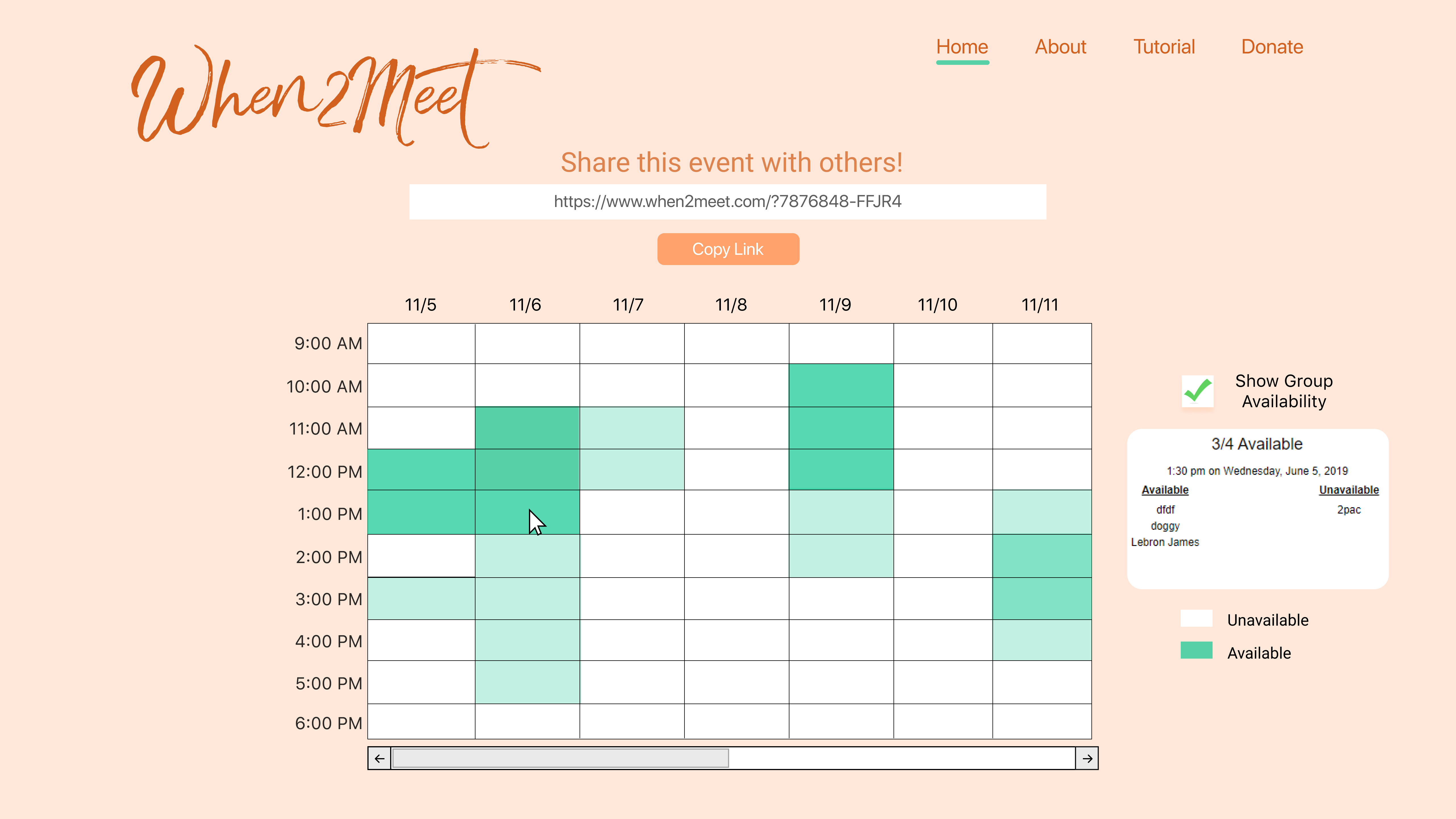
Final design: